Mastering Mobile-Friendly Content Design

In today's digital age, mobile devices have become the primary means of accessing information on the internet. As a content-driven SEO expert, mastering mobile-friendly content design is crucial to ensuring your website ranks well and provides a seamless user experience on all devices. Let's dive into the key principles, techniques, and tools you need to create compelling mobile content that engages users and boosts your SEO efforts.
Understanding Mobile-First Indexing
What is Mobile-First Indexing
Mobile-first indexing is a method used by search engines to prioritize the mobile version of a website's content for indexing and ranking. This means that the mobile version of your site is considered the primary version for determining how well your site will rank in search engine results pages (SERPs).
Why It Matters for Your Website
Mobile-first indexing matters because more people are using mobile devices to access the internet than ever before. If your website is not optimized for mobile, you could be missing out on valuable traffic and potential customers. Additionally, Google has stated that websites that are not mobile-friendly may not rank as well in search results, making it crucial to ensure your site is designed with mobile users in mind.
Key Principles of Mobile-Friendly Design
Simplifying User Interface
In mobile-friendly content design, simplicity is key. A cluttered and complex user interface can lead to a poor user experience on mobile devices. To create a mobile-friendly design, consider the following:
- Use clear and concise navigation menus
- Limit the amount of text on each page
- Opt for larger buttons and clickable elements for easy touch interaction
- Ensure that images are optimized for quick loading times
By simplifying the user interface, you can enhance usability and make it easier for mobile users to navigate your content.
Optimizing Page Speed
Page speed is crucial for mobile-friendly content design. Slow-loading pages can frustrate users and lead to high bounce rates. To optimize page speed for mobile devices, consider the following strategies:
- Compress images and videos to reduce file sizes
- Minimize HTTP requests by combining CSS and JavaScript files
- Enable browser caching to store frequently accessed resources locally
- Use a content delivery network (CDN) to distribute content geographically closer to users
By optimizing page speed, you can improve the overall user experience on mobile devices and increase engagement with your content.
Crafting Content for Mobile Users
In today's digital age, creating content that is optimized for mobile users is essential for any successful SEO strategy. With the majority of internet users accessing websites on their mobile devices, it is crucial to tailor your content to cater to this audience.
Short and Snappy Wins the Race
When it comes to mobile-friendly content design, less is often more. Mobile users are typically on-the-go and have shorter attention spans, so it is important to keep your content concise and to the point. Use short paragraphs, bullet points, and subheadings to break up text and make it easier for users to digest information quickly.
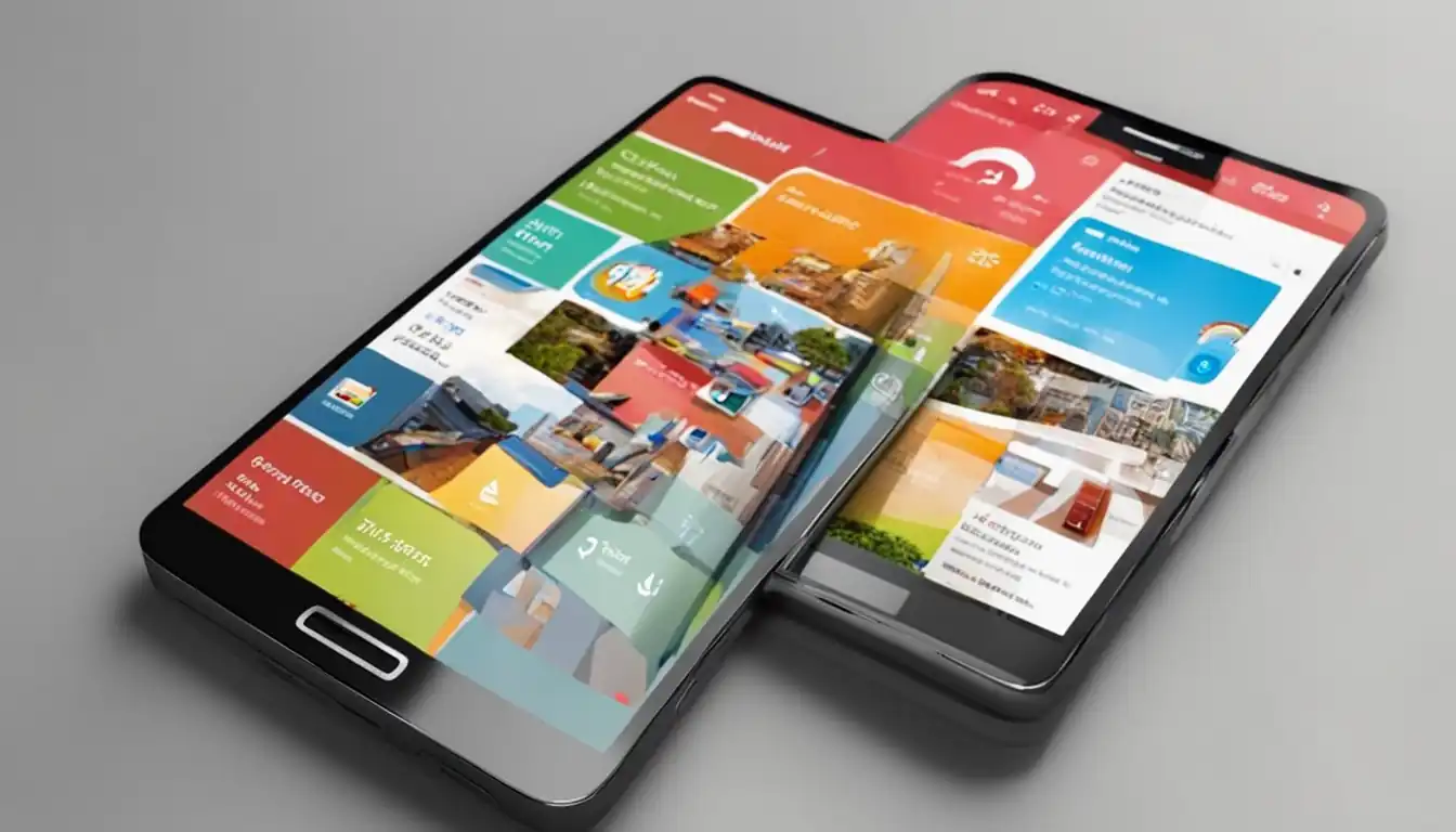
The Role of Visuals in Engagement
Visuals play a key role in engaging mobile users and keeping them on your website longer. Incorporate eye-catching images, videos, infographics, and other visual elements to break up text-heavy content and make your pages more visually appealing. Remember to optimize all visuals for mobile viewing to ensure fast loading times and a seamless user experience.
Technical Aspects to Enhance Mobile Readability
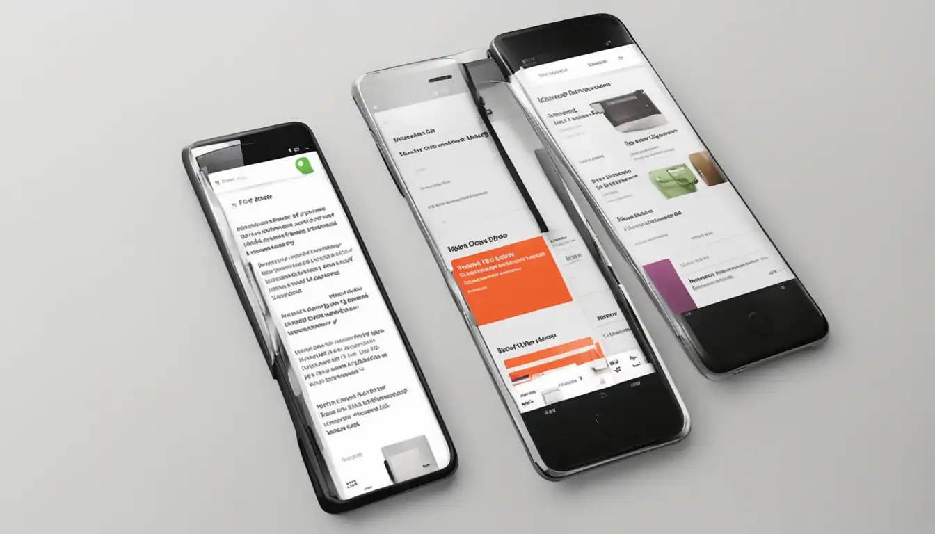
Responsive Design Techniques
Incorporating responsive design techniques is crucial for ensuring that your content is easily accessible and readable on mobile devices. This includes using fluid grids, flexible images, and media queries to adapt the layout of your website to different screen sizes.
Key Points:
- Utilize CSS media queries to adjust the layout based on screen size
- Ensure images are optimized for mobile viewing
- Test your website on various devices to ensure responsiveness
Font Sizes and Button Dimensions
Choosing the right font sizes and button dimensions is essential for mobile-friendly content design. Text should be legible without zooming in, and buttons should be large enough to tap with ease on a touchscreen device.
Key Points:
- Use a minimum font size of 16px for body text
- Increase font size for headings to improve readability
- Ensure buttons are at least 44x44 pixels in size for easy tapping
Remember, optimizing your content for mobile devices not only improves user experience but also plays a significant role in SEO rankings. By focusing on these technical aspects, you can master mobile-friendly content design and attract more visitors to your website.
Testing and Improving Your Mobile Content
In order to ensure that your mobile content is optimized for user experience, it is essential to test and continuously improve it. Here are some key strategies for testing and improving your mobile-friendly content design.
Tools for Mobile-Friendliness Testing
There are several tools available that can help you test the mobile-friendliness of your content. These tools provide valuable insights into how well your website performs on mobile devices and offer suggestions for improvement. Some popular tools for mobile-friendliness testing include:
- Google's Mobile-Friendly Test: This tool allows you to enter a URL and see how Google views the mobile-friendliness of your website.
- GTmetrix: GTmetrix provides a detailed analysis of your website's performance, including its mobile-friendliness.
- Pingdom Website Speed Test: This tool helps you analyze the speed of your website on both desktop and mobile devices.
By using these tools, you can identify areas where your mobile content may be lacking and make necessary improvements to enhance user experience.
Iterative Design for Better User Experience
Iterative design is a process in which you continuously make small changes to your content based on user feedback and data analysis. By adopting an iterative design approach, you can gradually improve the user experience of your mobile content over time.
Key steps in implementing iterative design for better user experience include:
- Collecting User Feedback: Encourage users to provide feedback on their experience with your mobile content through surveys, polls, or direct communication.
- Analyzing Data: Use analytics tools to track user behavior on your website and identify areas where users may be experiencing difficulties.
- Implementing Changes: Based on user feedback and data analysis, make small adjustments to your content design to address any issues that may arise.
By continuously testing and improving your mobile-friendly content design through iterative design, you can create a seamless and enjoyable experience for users accessing your website on mobile devices.